We frequently are asked if we can print white text on black paper. We don't have that as an option, so the next choice is to cover your page with ink, and leave your text area unprinted. While we do not recommend this, there are a few things you can do to help improve your results. You will either need to use the 80# gloss paper stock or get color printing, and we'll discuss both options below.
We'll use this page as a sample.
This is a sample of this page printed using our "Black Interior Printing" option on 60# Natural stock.
Let's take a look at how these results can be improved.
80# gloss stock
If you are printing your job on 80# gloss paper, there is not much special preparation needed. This paper stock will automatically run on our Xeikon presses instead of the normal black text printing press. The black text presses do a great job with text, and can handle images that don't have large areas of dark coverage, but are not designed to print heavy coverage of black toner across large areas like our sample above. The 80# gloss stock looks great with just 100% black ink coverage in large areas, and does not need additional CMY printing to get nice and dark the way non glossy stocks do. We'll discuss that now. If you want this look for your book, 80# gloss stock is absolutely your best option.
Natural and Opaque stock
The first thing to discuss is that you will need to pay for color printing. The black interior printing is done on a printer that is designed for text and some light image reproduction.
If you want to print something in this style but want to do so on any non gloss paper stock, you will need to make special adjustments to your file. The adjustments we are about to discuss are only possible in advanced layout software like InDesign. If you are doing your layout in Word, the only option we can offer you is the 80# gloss mentioned above.
To get your best results on these stocks, it's recommended that you use a color build of 30C/30M/30Y/100K for your background. 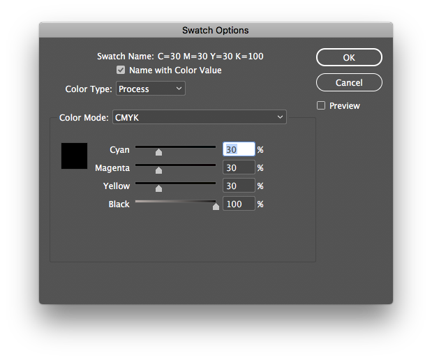
This will put down a neutral base under your black ink, and make everything look nice and rich. Often times people who use only 100K (black ink) would describe the result as dark gray or light black when seeing the print. Here is an example of 2 scanned pages. The one on the left is a rich black, the one on the right is 100K only.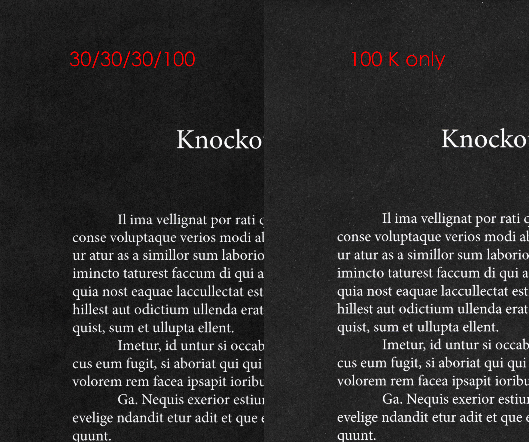
Using this darker color build can present an issue when it comes to registration. Instead of having one ink plate stop exactly where your unprinted text area begins, you need 4 to stop together. Modern digital presses are substantially better at keeping tighter registration than older offset units, but nothing is perfect. Here is a highly magnified photo of a printed sheet that has a very minor alignment issue of the magenta plate. Notice how you can see a few magenta dots creeping into the unprinted area of the letter L.
Under normal circumstances, no one would ever notice this. It is well within an acceptable professional tolerance. However, there is simple trick you can do to your document, to make sure nothing like this happens. By adding a .5pt thin 100K stroke aligned to the outside of your text, you can eliminate that need to have all 4 plates stop exactly in the same place as we discussed earlier. 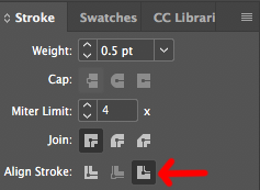
This will make your document look something like this on screen. Notice how the area around your letters, are slightly lighter. This is because you have cutback the CMY inks in the area just around the area you want to remain unprinted.
When this is applied, you will always have a crisp line where your black ink meets the unprinted area of the paper as seen in the highly magnified photo below.