You may be looking at this page because you recently received your first proof copy, or in advance of ordering your first proof copy and you received a notice from our prepress team. We will show some examples of layout files and the printed results so that you can understand how the physical construction will effect artwork that goes across the spread.
We will offer some advice on how to alter your files to change these results, but the most effective way to improve your final product is to modify your layout to avoid attempting to have any important elements near the binding.
- 1. Don't put any focal point of your images in the binding. The most common issue would be a face, but it could be anything the eye is drawn to in your image.
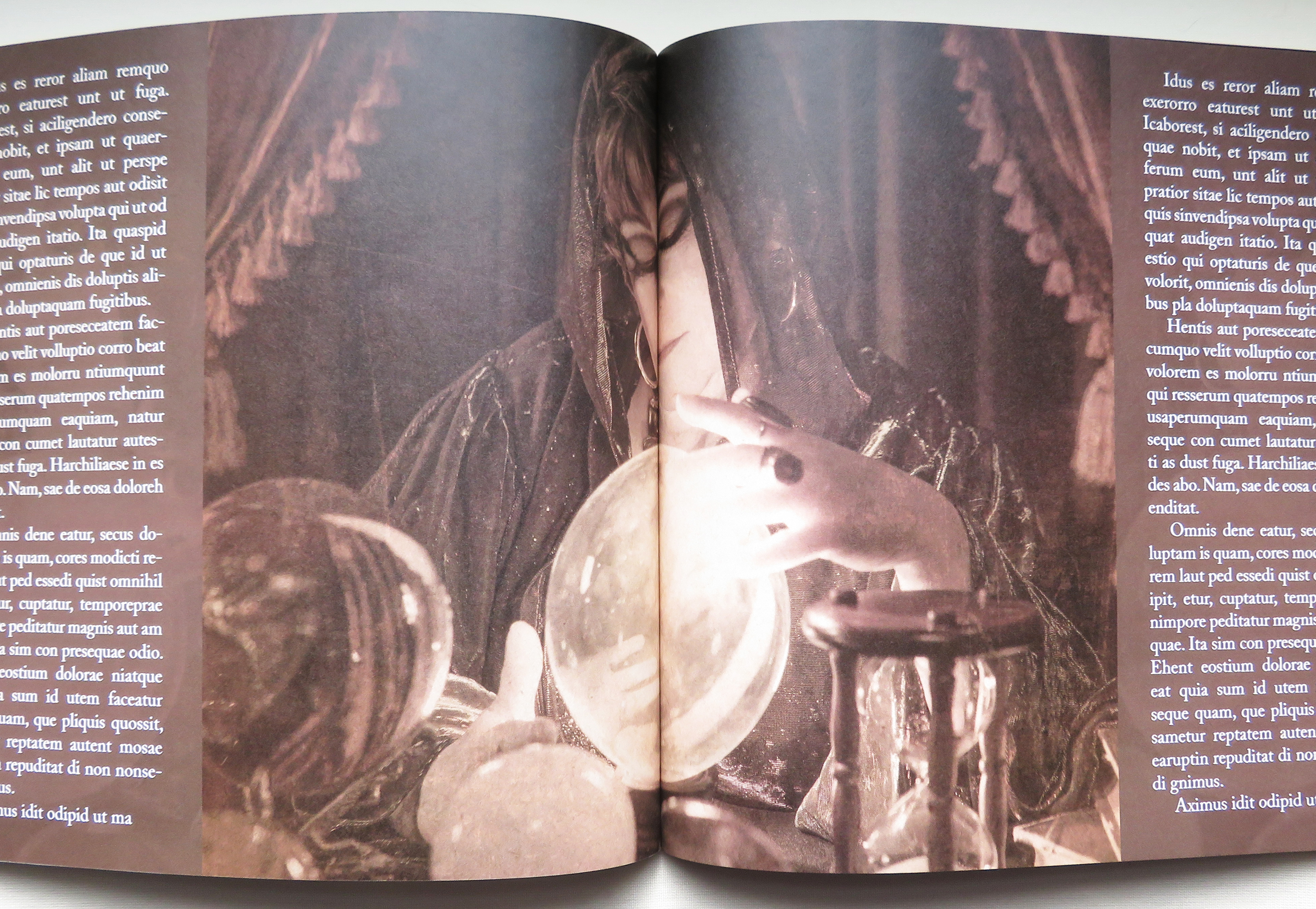
This image started out looking like this in the file: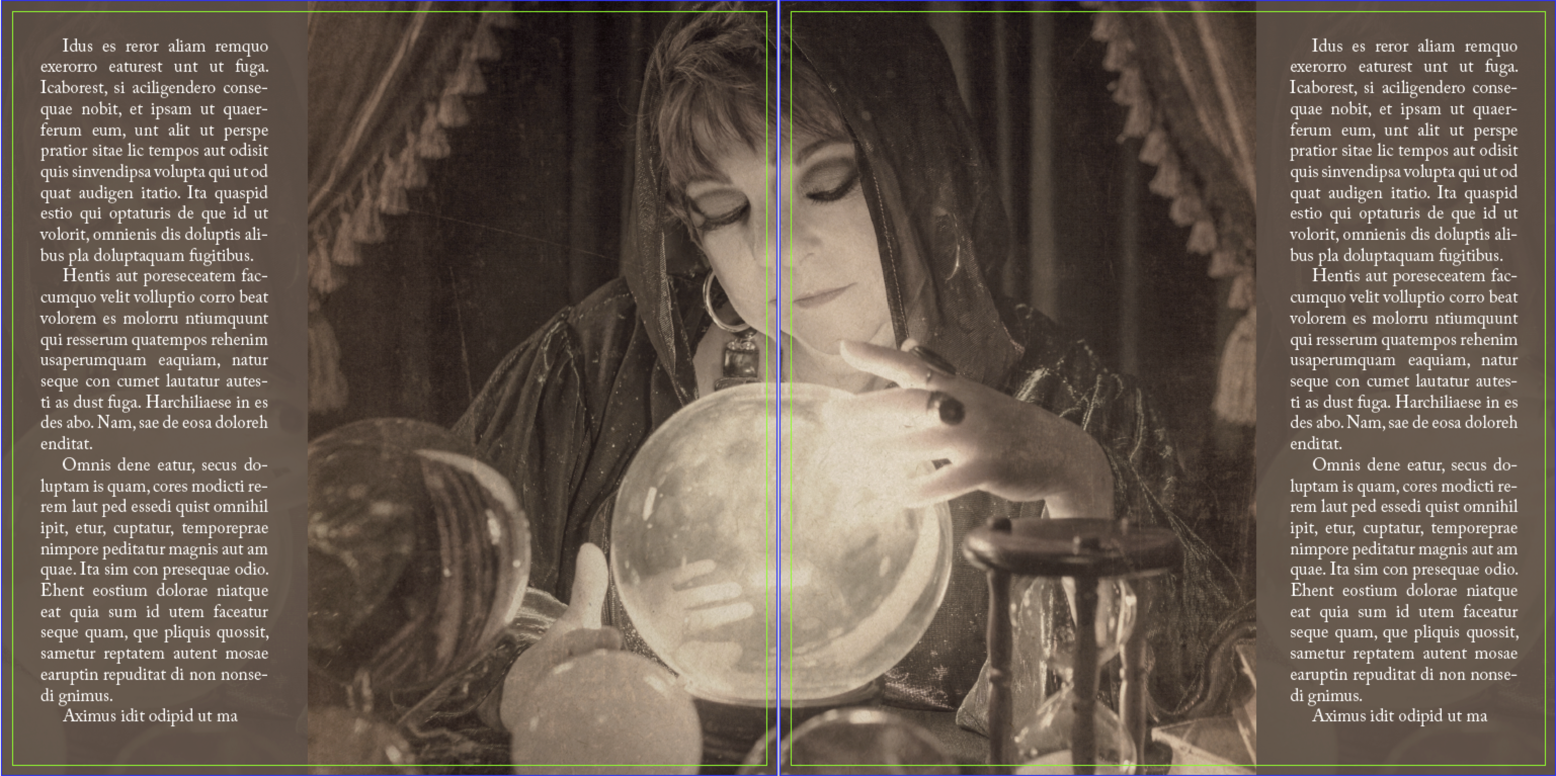
In this screenshot, the green line represents the trim line. When the book is cut, the duplicate part of the image would be cut away and would line up pretty well if they were laying on a flat surface side by side. But we are not talking about a flat surface; a book is a three-dimensional object. The joint is glued down at the spine and the pages come out in two different directions, the artwork will never line up perfectly. It would produce a much better result if the fortune teller and the crystal ball were moved to the left or right, avoiding the joint altogether. - 2. Don't run text across your binding.
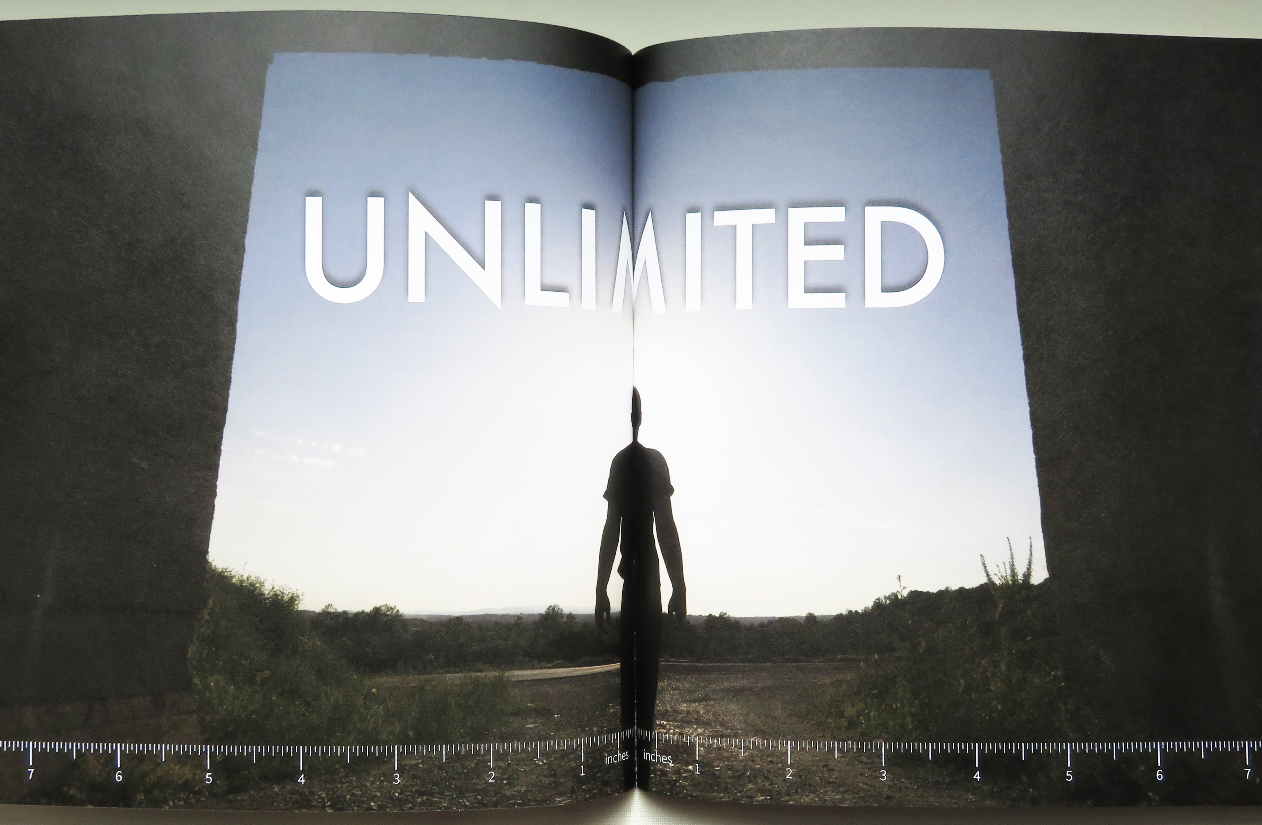
You can see that this page has the same image problem as number 1, but now we have a headline of text as well. The man in the middle largely disappears, and the "M" is missing a big chunk of the middle.
You may think this is related to the cutting of the pages, so we added a ruler to the bottom of the page to show you that both pages were cut on the zero mark, at the trim line.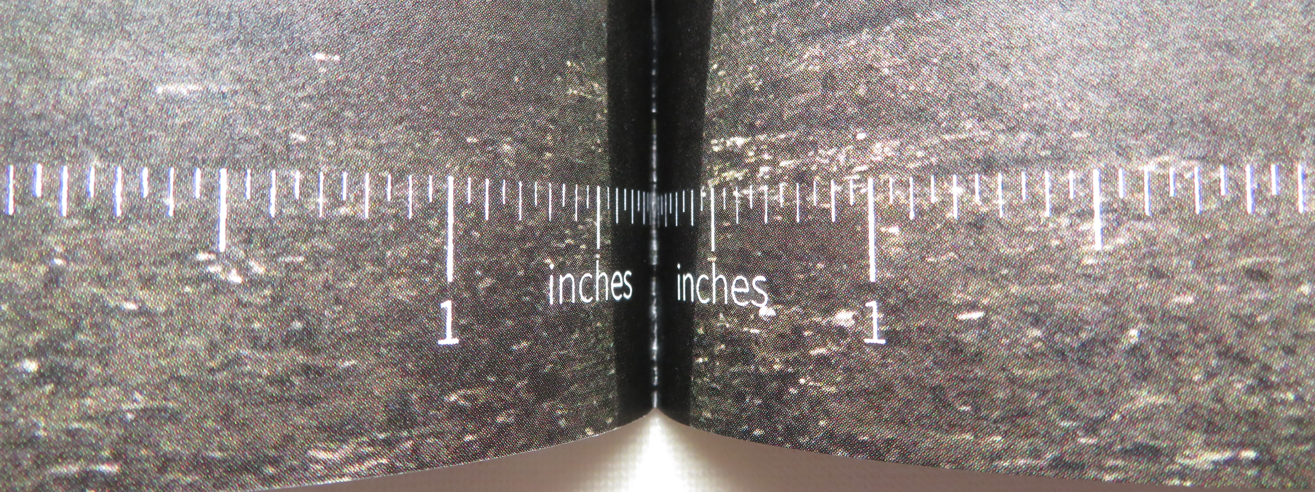
- 3. At this point, you may be wondering if there is any way to improve your results. I would like to reiterate that your best results are always going to come from modifying your layout to keep these elements from crossing the binding. If that is an impossibility in your layout, you can improve your results by repeating some of your layout around the binding.
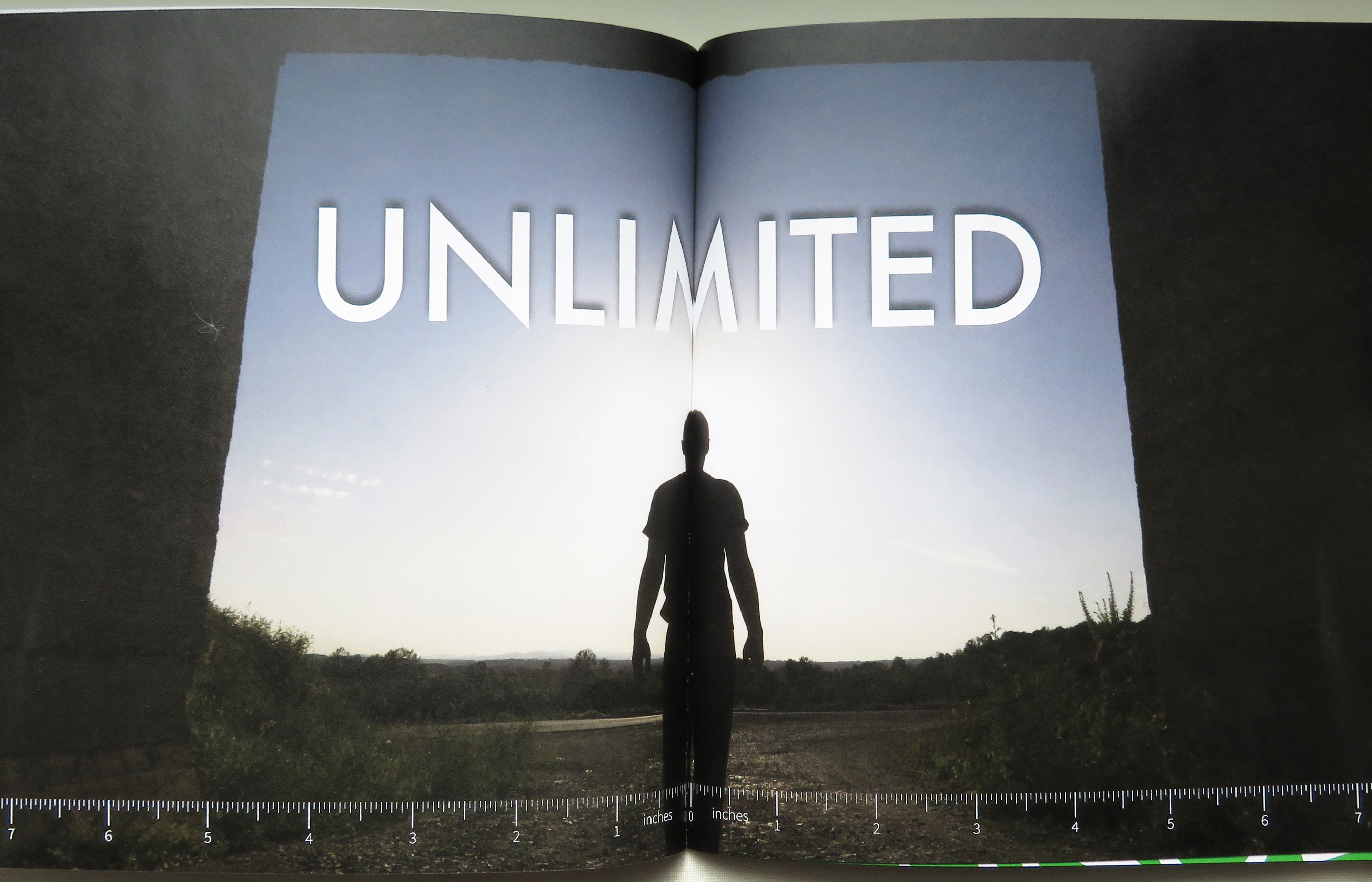
This spread was printed with a repeated eighth inch on either side of the binding edge trim line. This repeated area helps to push the art away from the binding and can result in a smoother look. Be careful about adding too much of an overlap, because the results can be worse than not adding overlap.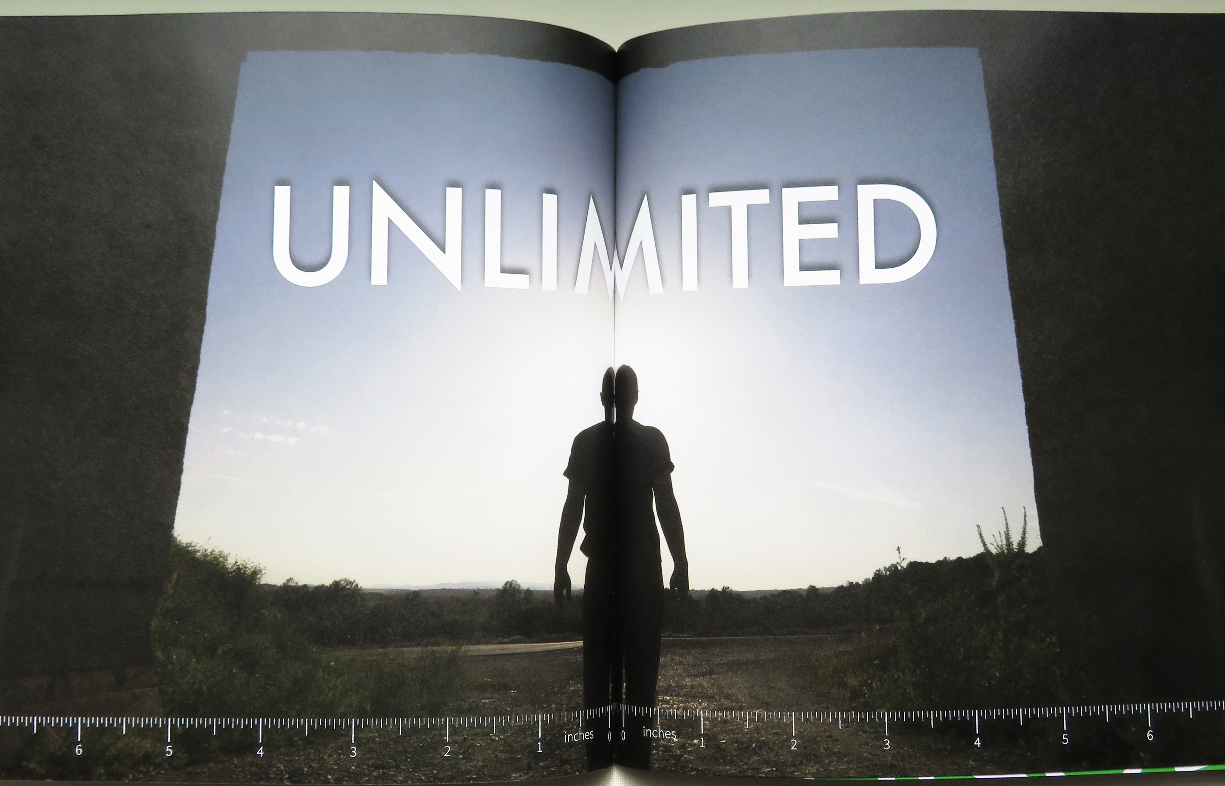
This sample was printed with a repeated quarter inch on either side of the binding edge trim line. The man in the photo now has two heads, and we've created a new letter that is part "M" and part "W".
Here is a quick video showing how to accomplish this in InDesign. To make it quick and easy to follow, we are using a singular image in a frame. If you have text boxes and other elements in your spread in Indesign, this will involve grouping and clipping masks and be much more complex. There is a reason this should only be used as a last resort when altering your layout isn't an option. If Bookbaby is formatting your book for you, we will not perform this.
- Using the Selection tool, click on your frame.
- Copy it, then "Paste in Place".
- Move that frame +.125" on the X-axis. (You may want to use up to .25" if you have a hard cover.)
- Select the original frame and move that frame -.125" on the X-axis.
- Select the frame in the foreground, and move the edge of the mask to where the 2 pages meet in the middle.
This is going to look off in the file, but you may prefer the results. You should always order a proof copy to make sure everything is to your liking before placing your full order. - 4. There is a difference between how images will cross the binding of a soft cover and a hard cover book.

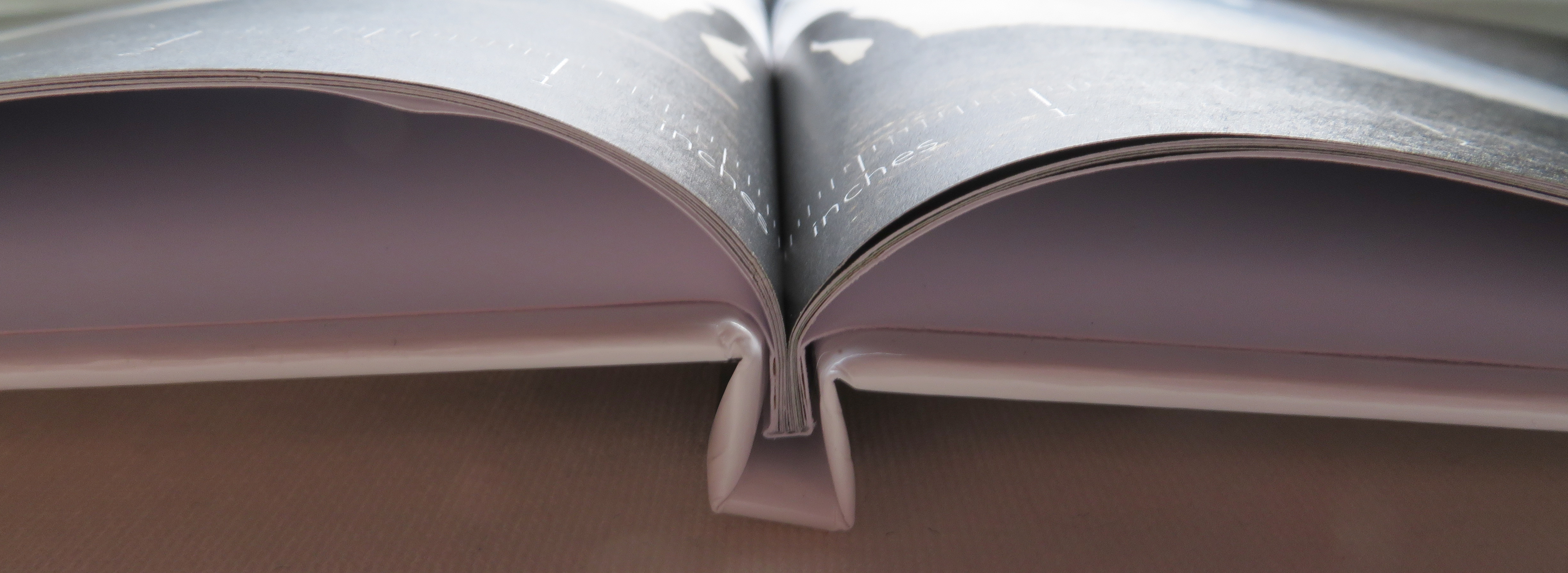
Notice how on the hard cover sample, the first bit of the page after the binding exists deeper in the book. More of the artwork will be lost due to the difference in the binding type. -
